![VeryGoodCopy [Small].png](https://images.squarespace-cdn.com/content/v1/5615edeae4b0b9df5c3d6e90/1585608336873-1EETR5CFUD43NFT6IU0C/VeryGoodCopy+%5BSmall%5D.png)
In the 60s, beauty brands began running full-color print ads.

Never miss a VeryGoodCopy micro-article: SUBSCRIBE
L'Oréal.
Revlon.
Helena Rubinstein.
These full-color, full-page ads were vibrant, beautiful, and completely unprecedented for the time.
The ads looked alive.
Consumers weren’t used to that. The new style was exciting. It created a buzz.
So Revlon and L'Oréal and Helena Rubinstein and the rest of the industry doubled down. Magazines became saturated with full-color ads. It became the new standard.
Estée Lauder, co-founder of her namesake brand, recognized this shift. She saw an opportunity.
“If we run full-color ads, we’re going to look like our competitors,” said Lauder. “We’ll blend in.”
True.
When creative is on-trend — whether it’s the copywriting or design — it runs the risk of blending in, of becoming indistinguishable, especially at first glance.
![VeryGoodCopy [Small].png](https://images.squarespace-cdn.com/content/v1/5615edeae4b0b9df5c3d6e90/1585608953594-XT85CJM183FSAW2Z01BS/VeryGoodCopy+%5BSmall%5D.png)
JOIN THOUSANDS OF SUBSCRIBERS


“Let’s try something different,” said Lauder.
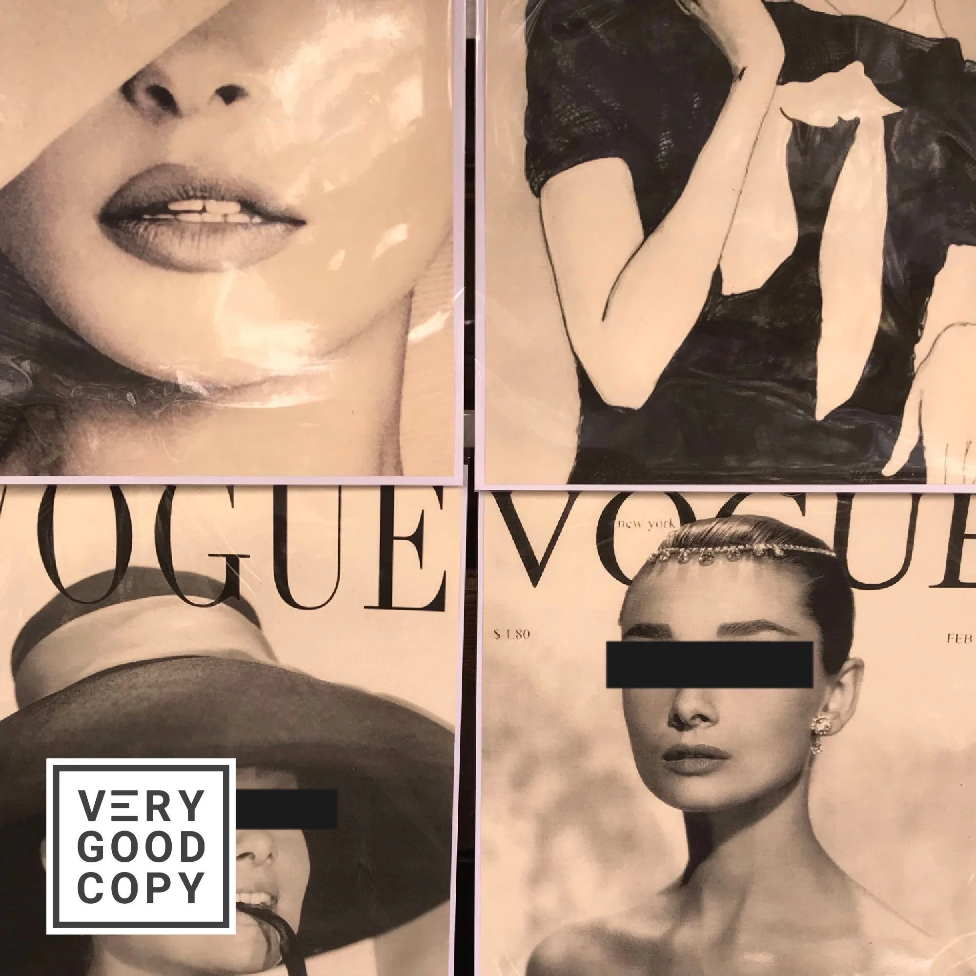
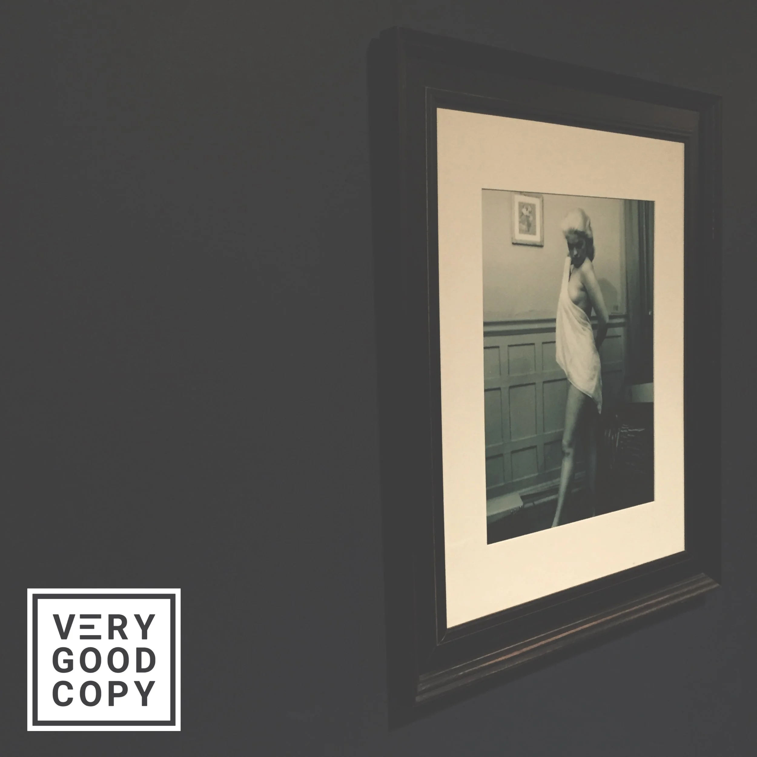
Estée’s next print campaign ran ads in sepia. They were void of color.
Her competitors called the ads “ugly.”
But those ugly ads pulled 30% more sales than Estée Lauder’s previous full-color campaign.
Master copywriter, Eugene Schwartz, said it best:
“The ugly thing in a world of beauty stands out.”
Want your marketing to stand out?
Make it “ugly.”
LEARN TO PERSUADE
![VeryGoodCopy [Small].png](https://images.squarespace-cdn.com/content/v1/5615edeae4b0b9df5c3d6e90/1585609077606-HI877PCWS96VJ9RJL34H/VeryGoodCopy+%5BSmall%5D.png)
WRITE BETTER.
MARKET BETTER.
SELL MORE.

![How to write better dialogue [easy, instant, Hemingway-inspired hack]](https://images.squarespace-cdn.com/content/v1/5615edeae4b0b9df5c3d6e90/1600810690603-XZIT3F465CS25186CILF/Better+dialogue+COMP.JPG)


![How copywriters put prospects in the buying mood [quick trick]](https://images.squarespace-cdn.com/content/v1/5615edeae4b0b9df5c3d6e90/1533095575515-C2JPAZA3C46IBX00EMM8/Put+prospects+in+the+buying+mood+%5BVGC+art%5D.JPG)


COMMENT BELOW
Judge not lest ye be judged.